Christoph Fahlbusch
Native apps, systems, AI workflows, and code
Native Design
Atlas FM treats live radio as a place-based system that has to survive when streams fail, metadata arrives late, and stations disappear. The iOS App Store version won't ship after three Guideline 5.2.3 rejections, because a highly polished globe of public radio reads less like a directory and more like a music streaming product. I'd rather move it to macOS than make it less itself, and I'm already working on a version with the same feel…
Atlas FM: the globe is the radio
Radio Garden proved that radio feels different when you listen by place instead of searching a list. You move across the world, tap a point, and hear whatever is live there right now.
Atlas FM started as my version of that idea, but built around native product behavior: motion that carries state, haptics that confirm intent, live audio that fails gracefully, and a player displaying beautiful micro-animations, and transitions.
The iOS version reached App Review and stopped there. That rejection became part of the product story, because the exact things that make Atlas FM feel super polished are also the ones that make Apple's reviewers read it as a 3rd-party rights risk.
Designing for a system you don't control
Live radio is a non-deterministic system. Streams cut out, metadata arrives late, stations rename themselves, and the listener can't tell why. Most of the design work in Atlas FM is about keeping the user's trust during those failures: static during handoff, fallback metadata, broken-stream skipping, motion that explains what's happening.
Why the iOS version stopped at review
Apple rejected Atlas FM three times under App Review Guideline 5.2.3, the 3rd-party rights rule. The reviewer wasn't pointing at a crash, a UI problem, a missing privacy label, or entitlement. The question was whether I had broadcaster-level permission to package public radio streams into a polished discovery product and ship that through the App Store.
I submitted the obvious package: Radio Browser's open API and directory license, a note that Atlas FM doesn't host, proxy, record, transcode, or redistribute audio, a removal contact, in-app Terms, and a reviewer explanation for the direct device-to-broadcaster playback model. None of that was wrong, but it didn't answer the question Apple was actually asking… Radio Browser grants directory and API rights, it can't grant broadcaster-level rights to the underlying streams.
Atlas FM also looked too much like a music streaming service. It had ICY now-playing metadata, iTunes artwork, ShazamKit for song identification, CarPlay support, favorite stations, and songs, a beautiful animated player, and a world-scale catalog that made every station feel one tap away. The same polish that made Atlas FM feel good in the hand made it harder to frame as a neutral radio directory.
So the iOS App Store version won't ship. The path that might pass review removes too much of what makes Atlas FM special.
The product philosophy
Atlas FM is an audio app, but the product idea is place, time, accident, and texture. Live radio still has all of that, and software can either preserve it or flatten it into a feed.
Place before preference
Most audio apps start with what they think you like. Atlas FM starts with where something is happening. A station is not just a source URL, it's a city, a coast, a border, a time zone, and sometimes a language you don't understand but still recognize as alive.
Tuning instead of loading
Moving between stations should feel like turning an FM dial, not waiting for a web request. Static, camera movement, haptics, and player states all point at the same thing: you're not opening another item, you're moving through radio.
Memory without a feed
Favorite stations and favorite songs are separate because they remember different things. A station says, I want to go back there. A song says, I want to remember what I heard there. Seamlessly move to Apple Music, or Spotify if you like a song.Taste Memory can help avoid bad turns, but it should never make the world smaller.
Mess is part of the medium
Streams fail, metadata arrives late, artwork is missing, and some stations disappear. Atlas FM doesn't try to make live radio tidy, it tries to keep the rough edge from becoming a people problem.
The macOS version keeps that same feeling… hopefully.
Moving to macOS means translating the same feel into a larger, familiar surface: the globe still has to behave like the FM dial, Drift still needs to feel like a moving signal, and the player still has to survive live radio without becoming a generic media window.
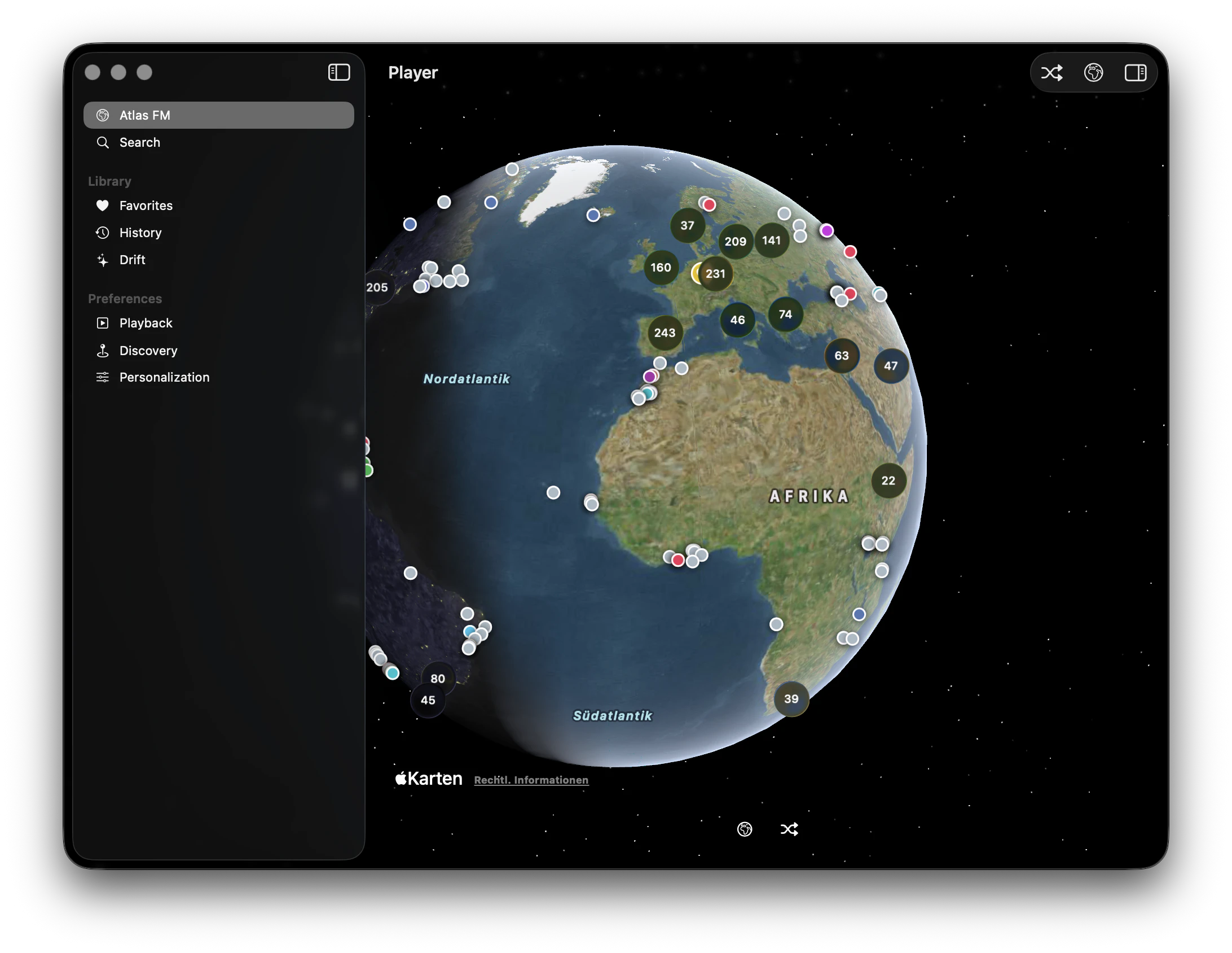
macOS potentially gives Atlas FM different strengths. A larger globe can carry more geography, keyboard search can be fast without becoming the main mode, hover can reveal station context lightly, and background audio can still sit beside work. The macOS app should still feel like Atlas FM on iOS, just with more room to breathe, with some specialties that macOS offers.
Radio Garden was the proof, not the plan
Radio Garden showed that radio can be global without becoming complicated. I certainly didn't invent globe radio, and I don't think Atlas FM needs to pretend otherwise. The interesting part for me was what happens when that idea is framed by a single designer, through native interaction quality instead of treated mainly as a map with audio.
Atlas FM is the same feeling through a different lens: a designer-built app where motion, haptics, failure states, audio handoffs, and saved traces are part of the product, not polish added after the interface already works. Free of charge, no ads, no bullshit.
Native feel isn't a skin
Native means more than SwiftUI controls or platform-looking surfaces. Transitions need to be interruptible, haptics need to confirm intent, background audio has to behave, motion needs weight, and every state has to stay readable while the app is already moving.
Atlas FM started as a craft question. What happens if the globe movement, station switching, compact player, expanded player, favorite stations, songs, and error recovery are treated as one continuous interaction system… ?
Taking care, and polishing experiences is the big difference between looking at an idea in a mockup, and trusting it in your hand.
The globe is the root
Atlas FM is the globe, not a list of stations. Pins aren't just markers, they're the navigation model for tuning by place: city, coast, island, border, region.
Search and genre filters support exploration instead of replacing it. The app should help you find a path without flattening the world into rows on the root level.
I wasn't trying to make radio efficient, I wanted to push what live radio can feel like.
Drift mode as a moving FM dial
Drift is hands-free world radio, but not just shuffle. People can control how long to stay on each station, and how far the next jump should feel.
A drift can stay close, moving through nearby cities and regions, or it can widen, crossing countries, languages, and time zones. The globe subtly moves between stations, the camera finds the next place, and static fills the handoff so the transition feels like tuning radio instead of loading.
The small confirmations
Favorite station heart animations, saved song stars, player artwork that moves instead of teleporting, text transitions for changing station and song metadata, haptics on station changes, and controls, static during station handoff, local time and region presentation in Drift, and compact player gestures that skip stations, and carry into the expanded player.
None of these moments are the feature on their own, but together they tell people the app is still with them, even when the stream changes, the metadata is late, or the globe moves somewhere new.
The player had to listen
The expanded player has equalizer bars that move with the music. On paper that sounds like a visual nice-to-have, but it only works if it feels believable. Drawing EQ bars is easy, making them feel attached to live audio is much harder.
Raw audio energy isn't a normal animation. It spikes, clips, disappears during silence, changes wildly between stations, and behaves differently when a stream is buffering or switching. If the EQ bars follow every sample too literally, they jitter. If they are smoothed too much, they become a fake screensaver. Getting it right means translating the signal: sampling, normalizing, damping, decay timing, and deciding how much truth the interface can show without looking broken. I spent more time on this than I would want to admit, but it was worth it.
Live radio makes that stranger because there is no clean song file with predictable levels. Sometimes music, sometimes speech, sometimes silence, sometimes a transition between two completely different sources. The EQ has to survive all of that, and still feel attached to what you hear.
I wanted the player to feel like it was actually listening, not just running an animation.
Live radio is messy, seriously…
Streams fail, metadata arrives late, some stations have very ugly, or no artwork, some songs can't be identified, and station data is inconsistent. Live radio is a beautiful system because it's alive, and alive systems are rarely tidy.
Atlas FM handles that mess with broken-stream skipping, ignored stations, fallback metadata, loading states, and careful transitions. I'm not trying to pretend the system is clean, I'm trying to keep every rough edge from becoming the problem of the people listening to it.
Atlas FM isn't trying to make live radio orderly, it's trying to keep the mess from feeling like a people problem.
Saving favorite stations, and songs
Favorite stations and favorite songs are different kinds of memory: a station is a place to return to, while a song is a trace of what you found, and liked there. For later listenting, songs can be opened in Apple Music or Spotify, but the main point is that discovery leaves a trail, and that trail has different meanings depending on whether it's a station or a song.
The app separates "I want to go back there" from "I want to remember what I heard there."
Taste Memory without killing discovery
Taste Memory learns from play, save, skip, and ignore behavior. It helps surfacing better recommendations and automated choices, especially in Drift, but it shouldn't turn Atlas FM into a curated feed.
The danger of personalization is that it makes the world of live radio a lot smaller. Atlas FM tries to make wandering more comfortable without making it predictable. The system should learn enough to avoid obvious wrong turns, but not so much that every path leads back to the same taste.
A designer without an engineer, 5 weeks of time.
Atlas FM also tested how much production behavior I could own as a designer without an engineer on the project. I wasn't drawing the interface or producing a Figma prototype, I was tuning real behavior on device until it could be felt.
What I cared about was to judge timing, haptics, failure states, language, motion, and restraint. The last stretch was making it feel like the right version of the idea, and that took much longer than the build itself.
The decisions that survive in the macOS version will be made on device, not in Figma. Drift pacing, the static handoff, the equalizer's response curve, and the saved-songs separation all got rewritten three or four times because they didn't feel right on iOS the first few times I built the app.
Closing
In order for Atlas FM to feel right, the globe had to stay the root layer of interaction, not just the visual.
The App Store rejection clarified the product more than I expected. I could probably redesign Atlas FM into something App Review finds less risky, but that would move it away from the product philosophy I actually care about: radio as place, movement as tuning, memory as a trail, and native feel as behavior.
So the work continues on macOS. Same idea, same feeling, more room, and hopefully less need to make the interesting parts disappear.