Christoph Fahlbusch
Native apps, systems, AI workflows, and code
Native Design
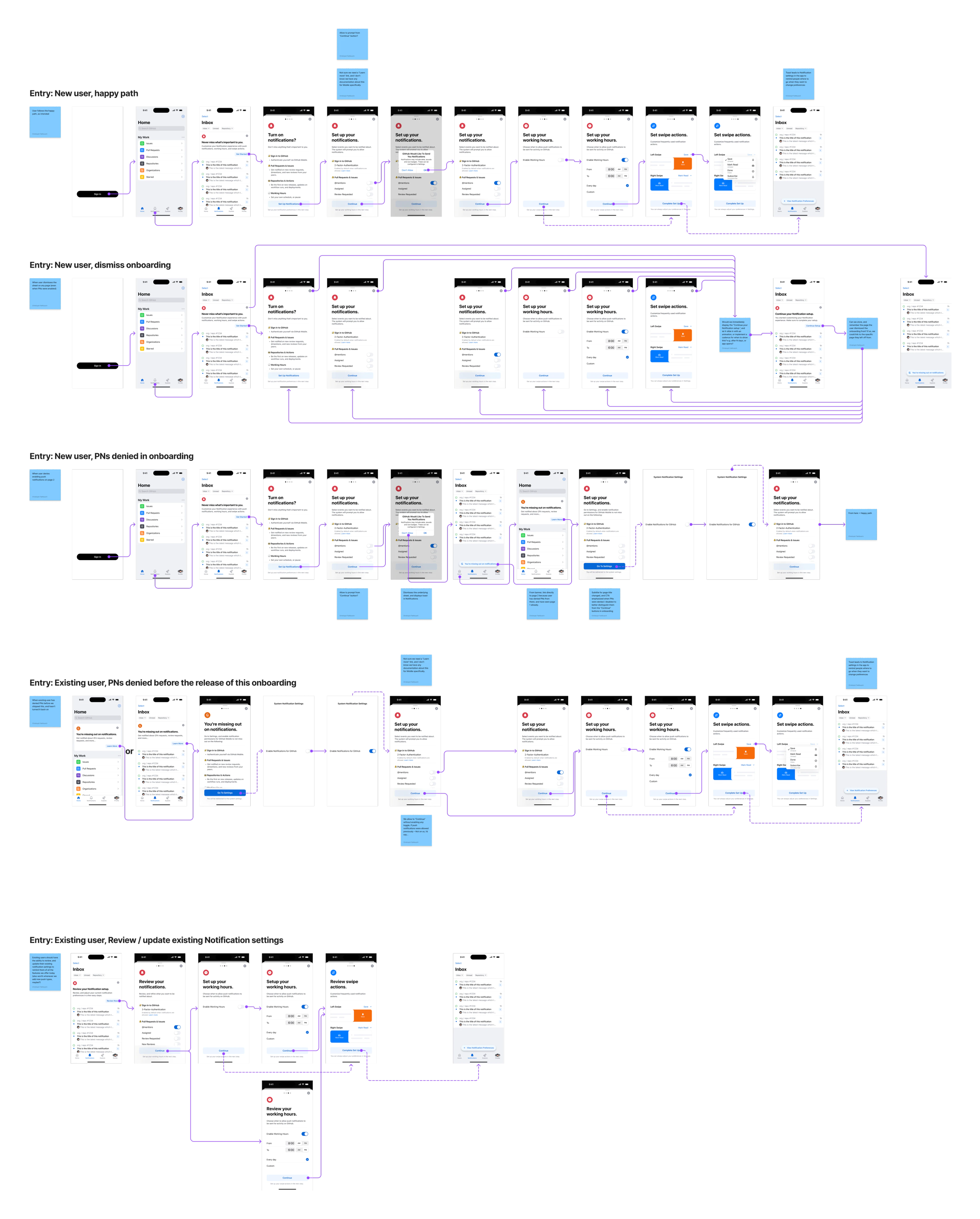
Notifications had become noise on GitHub Mobile, and the people most affected had already given up on them. We shipped Focused as an opinionated default: direct mentions, assignments, review requests, instead of asking everyone to rebuild years of settings. The recovery flow had three entry points so that new users, existing users, and people who had killed push notifications years ago each got a different invitation back in.
GitHub Mobile: Designing for the "Regular Tuesday": Signal vs. Noise
Notifications become a liability when they ask for too much attention, because people turn them off if there are too many, and miss work if there are too few.
At GitHub, a maintainer with a few busy repositories can generate thousands of notifications a day. We needed a system that protected their attention without hiding the work and could win back people who had already given up on the surface.
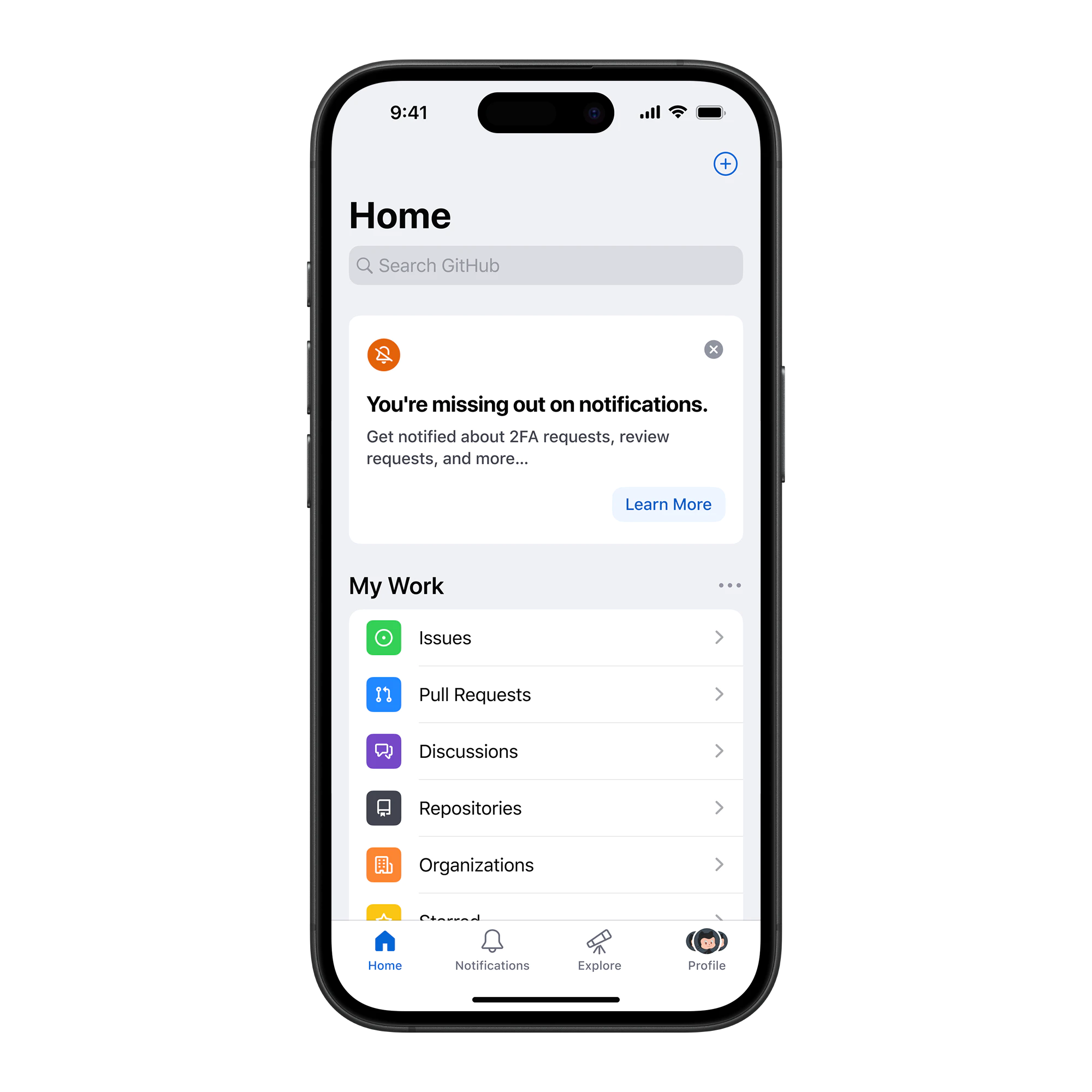
The infinite inbox problem
Users were starting to abandon the feature entirely. Our data showed that some people had stopped checking notifications at all.
Designing the default
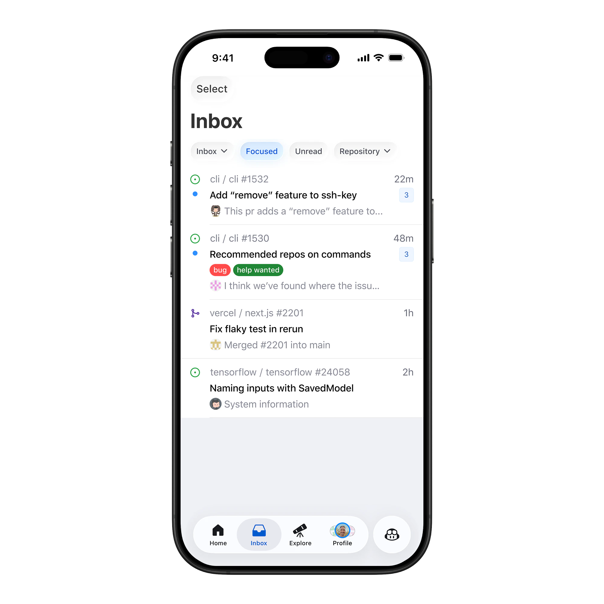
"Focused" was an opinionated default, not a power-user setting, so it had to be useful immediately and easy to trust.
For the filter, we started with direct mentions, assignments, and review requests because those are the high-signal interactions that block work. Everything else, including subscriptions, team pings, and CI statuses, was filtered out.
Recovery, not re-onboarding
Simply shipping the filter wasn't enough, because existing users already had years of notification settings, workarounds, and disabled switches.
Many users had turned push notifications off years ago because the volume was too high. We needed a way to invite them back in, but only if we could explain what had changed and give them control.
Different users, different recovery paths
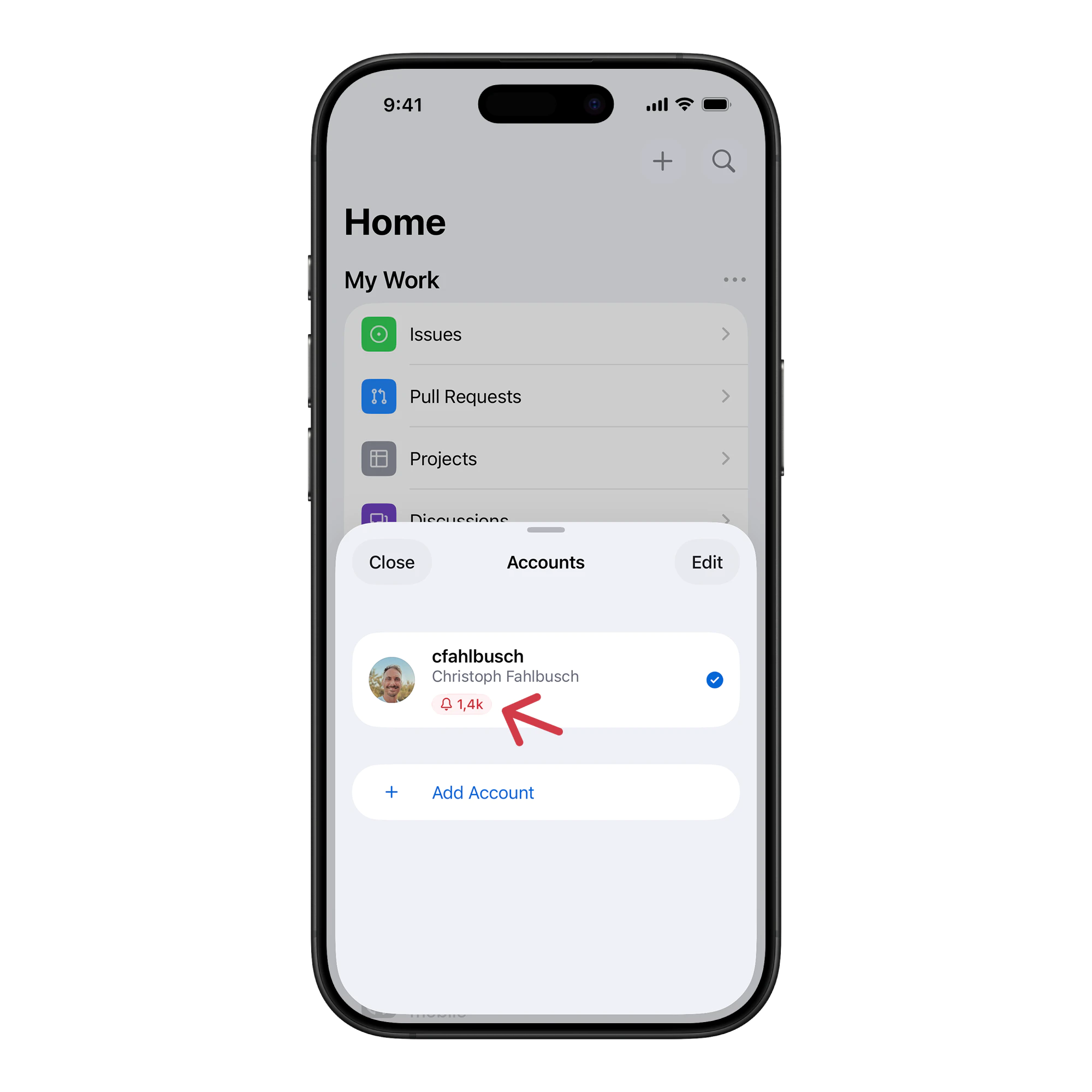
We built different entry points for different user groups. New users needed one path, existing users another, and people who had disabled push notifications needed something else again.
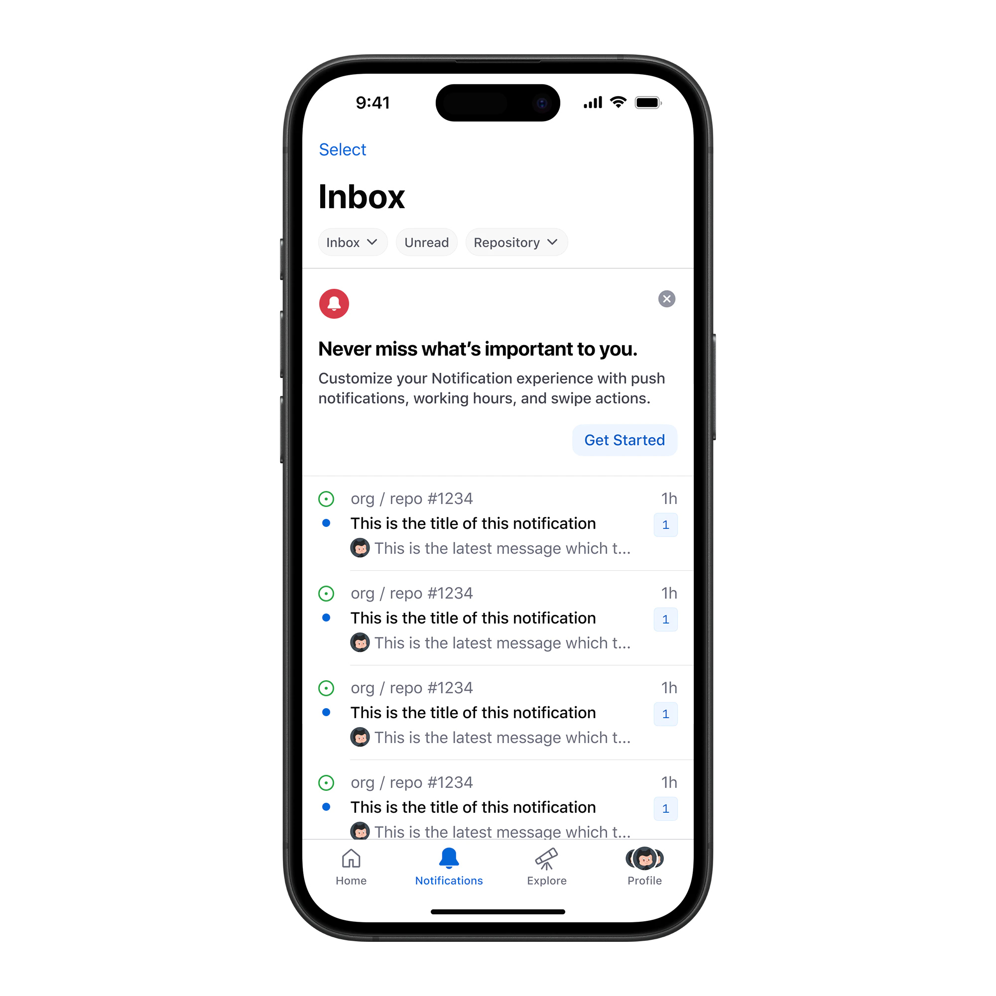
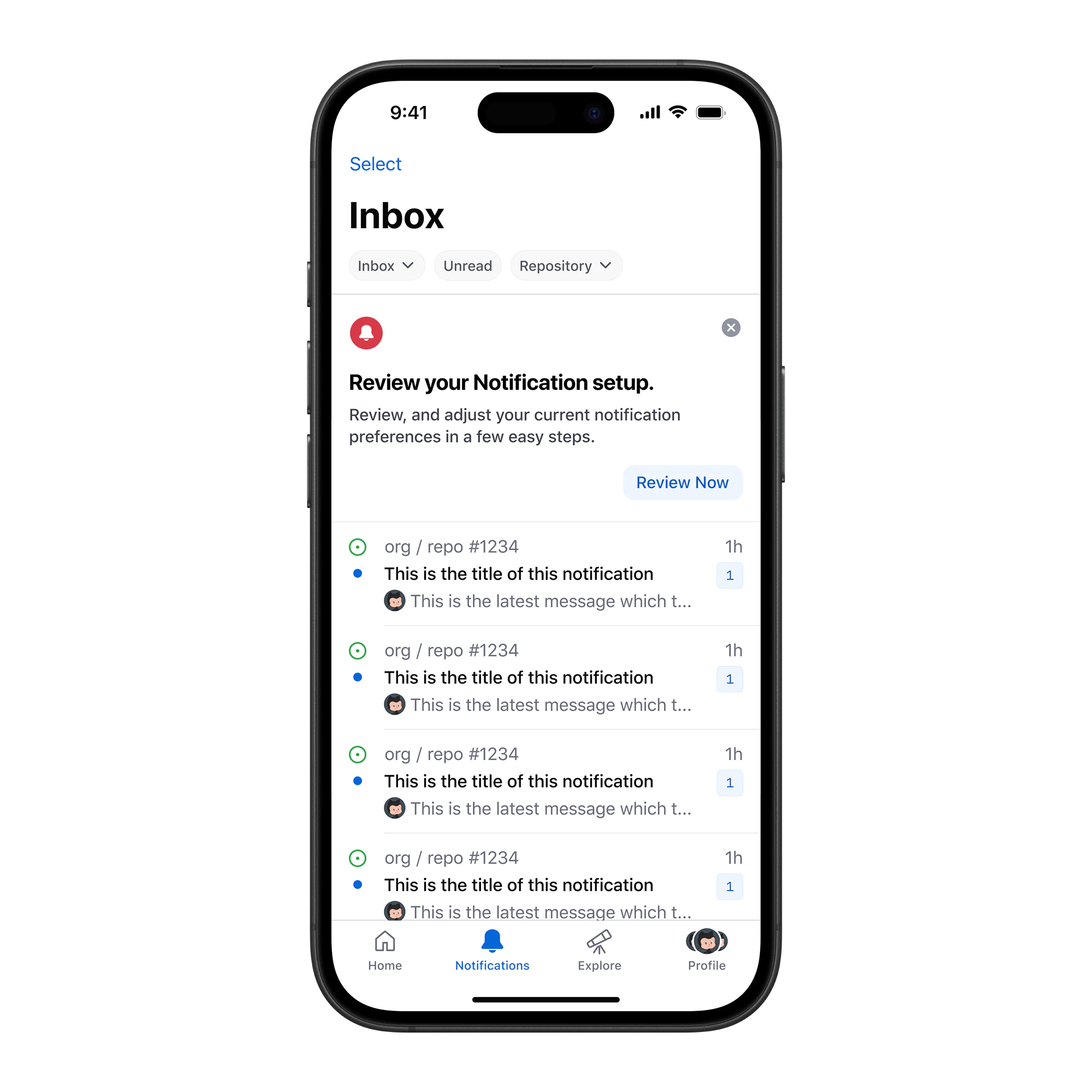
Each group needed a different message. For people who had disabled push notifications, we didn't ask them to turn everything on. We told them about new notification types and let them review their current configuration.
Respecting notification history
Designing this flow was tricky because we had so many different types of users. Some were new, some were power users, and some hadn't touched their settings in years. The experience had to respect all of that history.
The surface looked simple, but the complexity belonged in the system, not in the user's decision.
Recovering lost users
What surprised me was that high-volume users who had disabled notifications were the most likely to adopt the "Focused" setting.
They left because they hated the noise, not the product. Once we gave them a tool to manage the volume, they came back…
The strongest signal was that high-volume users who had previously disabled push notifications turned them back on once Focused gave them a way to manage volume. We tracked re-enablement rates by entry point, and the disabled-banner cohort outperformed the new-user banner on opt-back-in rate, which was the reverse of what most onboarding flows show.
Designing for the long tail
Retention is also day 365 maintenance, not just day one onboarding.
Focused Notifications works because it respects the "Regular Tuesday", the day when you're busy, tired, and just need to know if something is on fire or if you can ignore your phone.
Utility over engagement
We designed for utility instead of engagement. Reducing the volume of notifications increased the value of the ones that remained, and the flow respected what each user group had already set up.
Some design choices only make sense after someone has used a product for a long time. You can't only focus on the first 5 minutes. Designing for the long run means being okay with complexity, but keeping it hidden until the user needs it.
Closing
The work wasn't adding another filter, it was making notifications useful enough that people trusted the system again.
We had to respect where users already were, instead of pushing them back into settings they had stopped trusting.