Christoph Fahlbusch
Native apps, systems, AI workflows, and code
Native Design
I shipped a notes app where every constraint is a product decision. Capped daily suggestions, separated attachments, and typo-tolerant search replace the infinite feature list. The opinions are enforced in the data model, not just the interface, because UI-only opinions drift back to the default the first time the codebase changes.
Kurzgedacht: Opinions are features
Most note-taking apps fail because they try to be everything. They add features until the blank page starts to feel like a burden.
I built Kurzgedacht out of frustration. Every app I tried treated attachments as inline content. A few links and images later, the actual thought was buried. I wanted a notes app that had opinions about how notes should work.
The name is a play on "Kurzgesagt", German for "in short" or "in a nutshell". I swapped "gesagt" (said) for "gedacht" (thought), so roughly "briefly thought". Notes are meant to be captured fast and found faster, not organized into elaborate systems.
Transience over permanence
The Today view is a core part of the app. Users can set it to open automatically on their first launch of the day, then choose from up to 10 suggested notes to focus on. Once those suggestions are gone, there are no more until tomorrow. Most apps show you everything, but Kurzgedacht caps your daily attention budget.
The app suggests notes with a weighted heuristic engine. Overdue reminders score highest because they need to ask for attention. Notes you've reopened multiple times this week get a boost because they probably belong to an active context, even without explicit edits. Recent opens get recency bias because what you looked at yesterday is probably relevant today.
Smaller signals add texture: notes edited in the last 24 hours, notes with tags, and notes with attachments. The algorithm caps each category so the suggestions stay varied, not just a wall of overdue tasks.
Users can also manually pick notes for their day. It's a conscious act of selection, not a passive scroll through an infinite list.
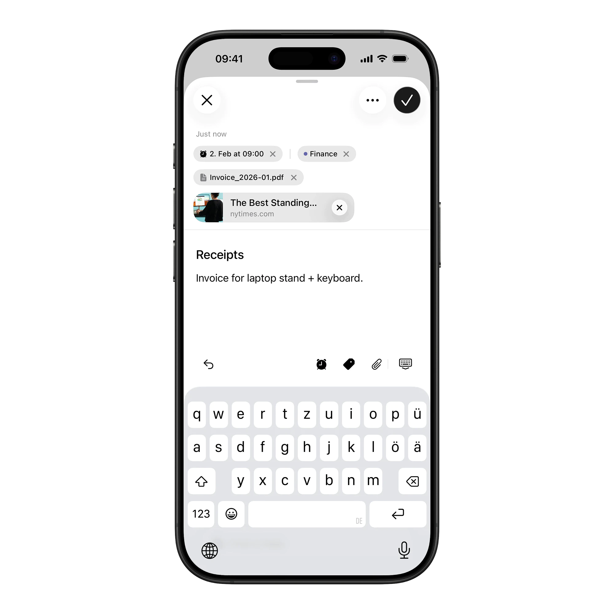
Attachments belong on notes, not in them
The original frustration was simple: in most apps, if you paste a link or drop an image, it lands inside your text. Three links and two images later, your note is unreadable.
Kurzgedacht separates content from attachments: links become cards, images go into a carousel, files get their own section, and the text stays clean.
This works because it's architecture, not just a feature. The data model enforces the separation, so the UI can't break the pattern.
Capture with zero friction
The fastest note is the one you don't have to think about.
When you open the app, it checks your clipboard. If there is something there, like text, a link, or an image, a floating Paste Card appears. One tap creates a formatted note with attachments already organized.
The system tracks clipboard changes to avoid repetitive prompts. It stays out of the way until you need it, then it's instant.
Privacy in public
Notes contain private thoughts. Sometimes you need to check something on a train or in a meeting without exposing your entire life.
Stealth Mode hides note bodies, images, and tags, leaving only titles visible. You can turn it on in settings, or use a hidden gesture: three taps on the header for quick activation. Haptic feedback counts the taps so you know it's working.
This isn't trying to be Face ID, it's faster, and it's for the moment when someone glances at your screen and you want plausible deniability, not a locked vault.
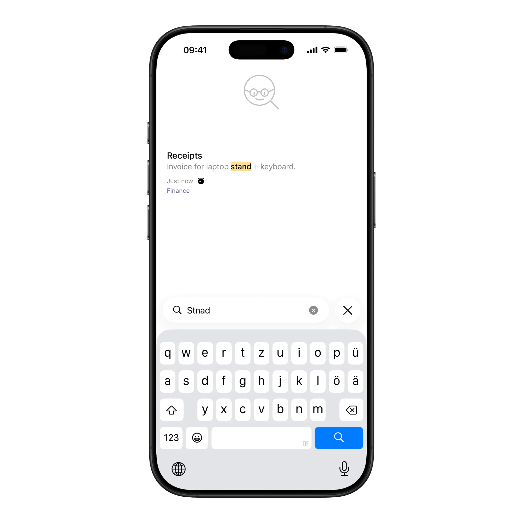
Forgiving search
You shouldn't have to spell perfectly to find your own thoughts.
The matching algorithm uses Damerau-Levenshtein distance, which handles transpositions like "teh" becoming "the". Tolerance scales with word length: short words (4-5 characters) allow one edit, longer words allow two, and very short words require exact matches to prevent noise. Bigram fingerprints quickly discard non-matches before running expensive edit-distance calculations.
Finding notes isn't enough, because ranking decides what shows up first. Exact matches beat prefix matches, which beat fuzzy matches. Title matches weight 10x higher than body matches, recently edited notes float up, and frequently opened notes get a popularity boost. Search should surface the right note first, not just find it somewhere in a list.
Advanced filters let users be explicit: has:check for checklists, has:img for images,
is:locked for encrypted notes, date:today for recent entries. The search adapts to how
people actually type under pressure.
Tactile feedback
Every interaction has haptics, from sorting and selecting to activating Stealth Mode and creating notes. The app feels physical even though the surface is glass.
Animations use matched geometry effects so elements move continuously instead of cutting between states: the FAB zooms into the new note sheet, cards slide into the Today section, and nothing teleports.
That level of polish isn't decoration, it's confidence. When the app responds predictably, users trust it with their thoughts.
Why this is here
Kurzgedacht is on this site because it's the cleanest test of a position I keep coming back to. Most product debates end up choosing between "let the user do anything" and "give the user opinions". The interesting answer is usually the third one: make the opinion structural so the rest of the product can rely on it. Attachments live outside the text because the data model says so, not because the UI hides them. Today caps at 10 suggestions because the algorithm decides, not because the screen has 10 rows. Once the opinion is structural, you can move fast on everything that sits on top of it.
Closing
Kurzgedacht works because the product makes decisions on purpose.
The Today view limits what you see, attachments stay out of the text, search forgives your mistakes. Those aren't toggles, they're the product. Not every note app gets better by offering more choice.