Christoph Fahlbusch
Native apps, systems, AI workflows, and code
Interaction Design
(Alles) Paletti started as an interaction-design experiment in SwiftUI: polished animations, deliberate haptics, and the difference between a tool that works and one you remember using. The design-token export side (SwiftUI, Compose, XML, CSS, Tailwind, W3C tokens) is the part that turned the app into a small piece of design-system infrastructure for everyone else. I'm reworking the next version on the side.
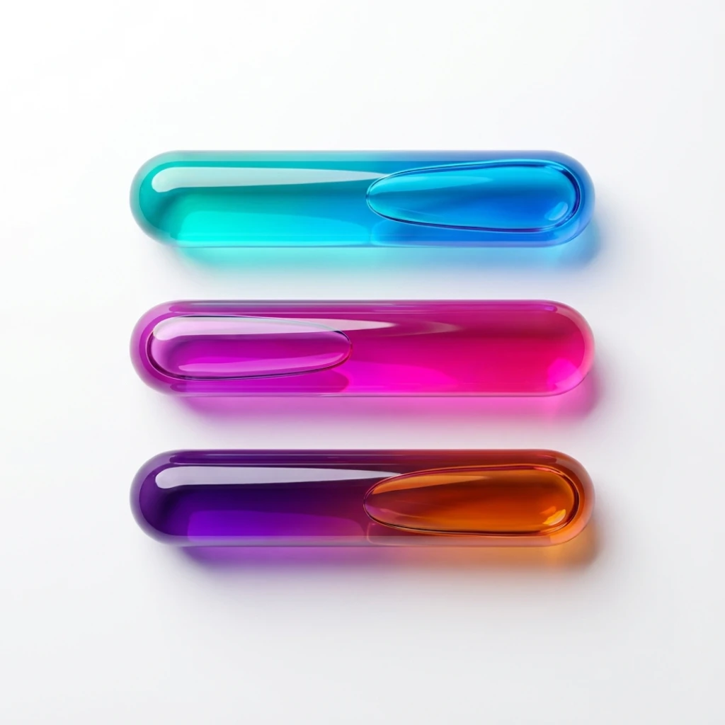
(Alles) Paletti: The details you feel
Color tools are everywhere, and most of them work, but fewer of them feel good.
(Alles) Paletti started as an experiment in SwiftUI animation. I wanted to see how far I could push fluid motion, haptic feedback, and visual polish on iOS. Many great apps, tools, and references influenced it. I'm reworking it on the side so it becomes a bit more distinct.
The color science isn't the interesting part on its own. The interactions are: polished animations, deliberate timing, haptics on every action, and the kind of details that don't show up in feature lists.
Launch choreography
The launch sequence staggers individual palette segments into the main view. Elements keep moving instead of cutting between states.
When things keep spatial continuity, users build the model faster. They understand where things came from and where they will go. The animation teaches the structure.
Choosing how to create
(Alles) Paletti offers multiple ways to start: Perceptual uniformity, classic harmonies like triadic and complementary, image extraction, or live camera input. Each mode starts the work from a different place.
The share sheet uses matched geometry effects, selections have haptic feedback. Those aren't big features, but they add up. The difference between "functional" and "polished" is often just timing, and the time you spend on polishing details.
Fine-tuning the last 5%
Generated palettes are starting points. Users can manipulate individual color segments and adjust hue and brightness until each color fits the work in front of them.
A palette tool that only generates and can't refine is limited. The last 5% is usually where it becomes useful in real work.
From colors to gradients
Users can turn any palette into smooth gradients with a single tap. The transition animates through color space, so you see the gradient form instead of just appearing.
Memory without management
Every palette is saved automatically, with no explicit save action and no lost work.
Users can pin up to 10 favorites, and pinned palettes stay at the top. The split between "pinned" and "recent" creates just enough organization without folders or tags.
Two audiences, one share sheet
Designers share palettes for different reasons. Sometimes it's for social media, and sometimes it's for developers who need structured code.
The developer layer provides copy-paste code for SwiftUI, Kotlin Compose, Android XML, CSS variables, Tailwind configs, and W3C design tokens. The same palette, formatted for whatever stack you're building on.
Closing
With color tools, the difference usually isn't capability, it's interaction quality. Animations, consistent haptic feedback, and transitions decide how the app feels to use.
In a tool like this, interaction design is the architecture.