Christoph Fahlbusch
Native apps, systems, AI workflows, and code
Native Design
I owned the mobile direction for pull request workflows on GitHub Mobile, working with engineering and product to reorder the flow around context, continuity, and safe decision-making. The job wasn't shrinking the UI to fit phones, it was deciding what people need to see first if review and merge are going to feel trustworthy on a phone.
GitHub Mobile: Pull requests with the right context first
Code review on mobile is difficult because the risk is real. People are deciding what to merge, what blocks a team, and what can wait, often while interrupted.
Screen size was secondary. The harder problem was making enough context available, early enough, that the workflow still felt safe.
The "read-only" fallacy
Early assumptions about developers using GitHub Mobile were too narrow. We assumed they mostly wanted to triage notifications, but data and feedback showed that people were willing to review and merge code from their phone. The demand for deeper work was there, but the tool was still carrying desktop assumptions.
We needed to make that work feel safe enough on a smaller, more interrupted surface.
Context before input
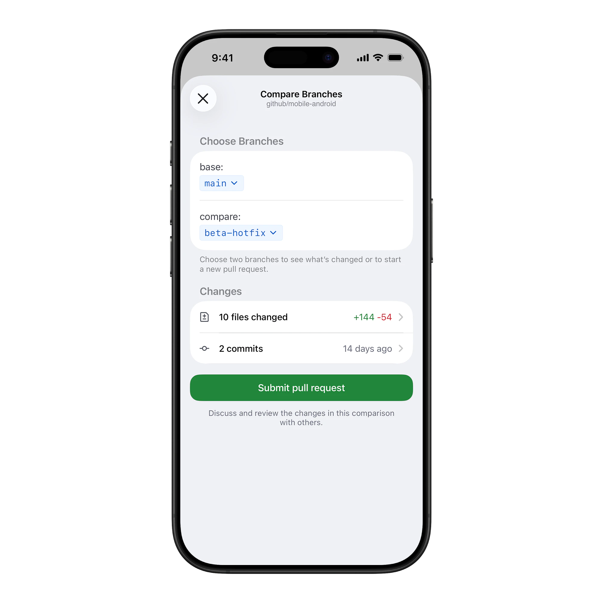
Creating a PR is usually a form-filling exercise, which gets tedious on small screens.
We inverted the model. Instead of asking for a title and description first, we show the code changes immediately when creating a PR from an existing branch. The user gets anchored in the "what" before anyone asks for the "why".
Showing the code first gave users the context they needed to write a better description, instead of remembering the change from another screen.
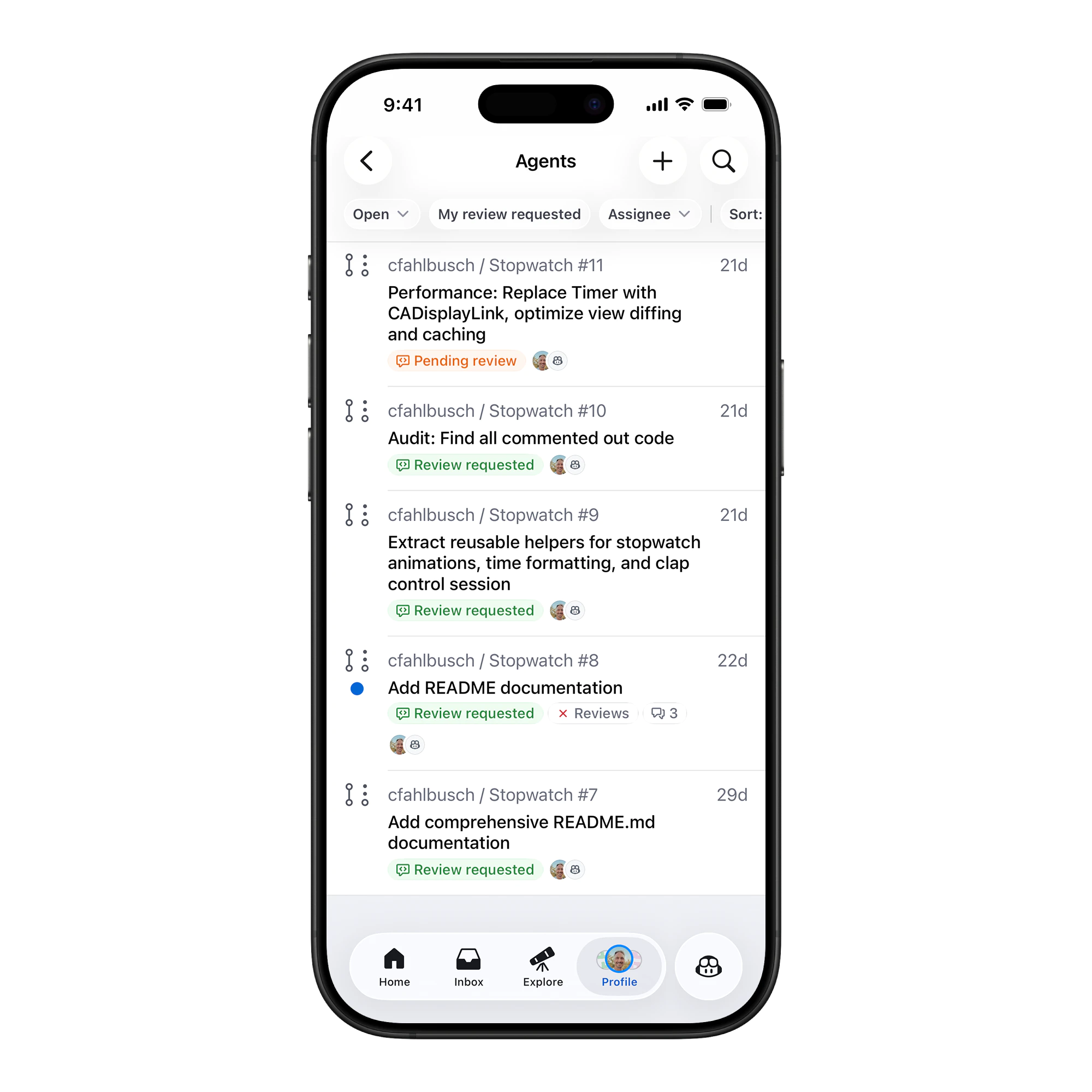
Making the queue legible
A list of Pull Requests creates work before the work starts because you still have to decide what blocks your team, what waits on you, and what can wait.
We redesigned the list view to be state aware. We explicitly highlighted "Review requested" and "Pending review".
The list becomes a prioritization surface, so the product should do more of the sorting before the user spends attention on it.
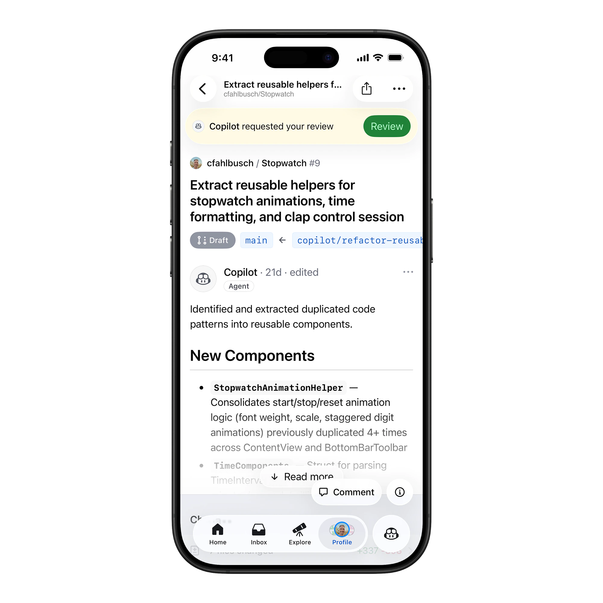
Adaptive UI
The interface changes based on your role. If you're the author, we show CI status and merge blockers. If you're a reviewer, we float the "Review" action.
We used sticky headers and adaptive banners so the primary action was available without taking over the screen.
Continuity across devices
Reviews are often multi-session tasks. You start on desktop, move to your phone, and finish later. The mobile experience has to respect that continuity instead of pretending every session starts from zero.
We carried the unread-comment state across devices, kept the last-viewed file scroll position, and surfaced the same merge-blocker reasons on phone that github.com showed in the merge box. The principle was that the phone shouldn't be a different mental model: it should be the same workflow, surfaced for a smaller surface and an interrupted attention budget.
Metric-driven iteration
We validated the direction with funnel analysis and product feedback. The strongest signal came from reviews started on mobile getting finished on mobile more often than they used to, which meant the context was holding up under interruption.
Closing
Pull requests work on mobile when the product does more of the context work before asking for action.
Reorder the workflow around context, and review and creation stop feeling like desktop tasks squeezed onto a phone.