Christoph Fahlbusch
Native app design, strategy, and systems
Native Design
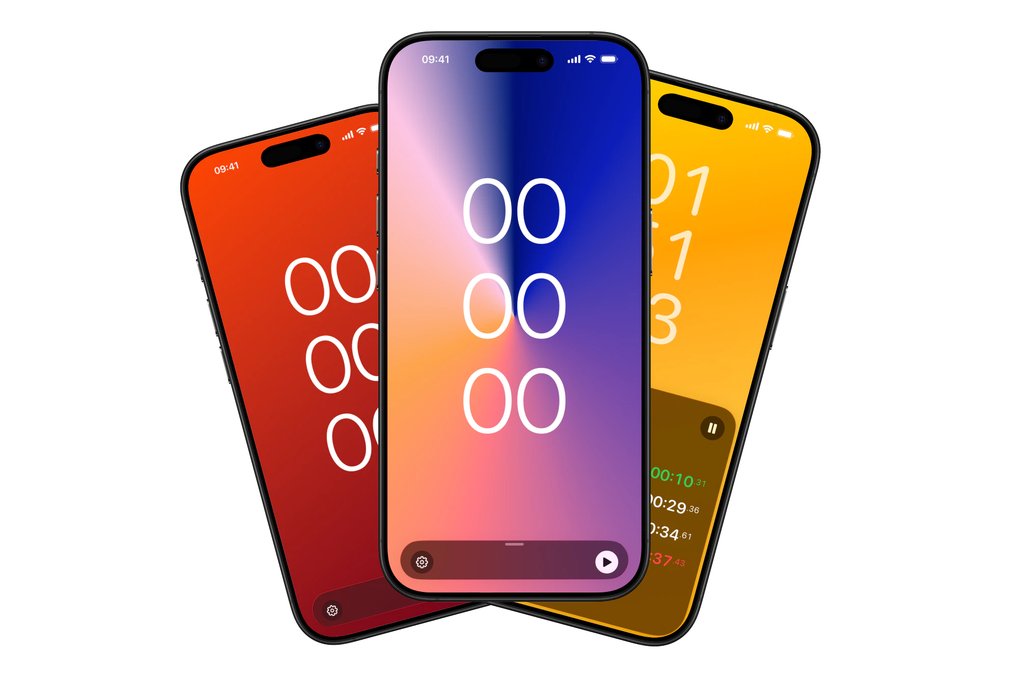
Built a stopwatch app designed for real conditions… sweaty gyms, kitchens, track fields, where the user is rarely looking at the screen. Full-screen tap targets, clap control, and binary contrast modes solve for impaired contexts that most utility apps ignore.
Tempra Ora: Complexity hides in simple tools
"It's just a stopwatch." That's the trap. When a tool has only one job, it has to do it perfectly. There is no feature list to hide behind.
I built Tempra Ora to test a hypothesis: Can you build a utility so refined that it feels like this is what all stopwatch apps should be like? It was an exercise in constraint, haptics, and environments.
The infinite canvas of zero features
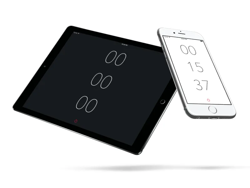
My first attempt, "Minimal Stopwatch", was pure reductionism. One reset button. Tap to start, tap to stop.
It was aesthetically pleasing for its time, but practically useless. It failed because it ignored the messiness of reality. Real life involves different environments, use-cases, laps, and uneven intervals.
Design for the "Unideal" State
Tempra Ora isn't designed for a desk. It's designed for a sweaty gym, a chaotic kitchen, or a track field.
The core thought behind it was that the user is rarely looking at the screen. They are focused on the event, not the tool.
Design for distance
If you're doing planks or cooking pasta, you're usually away from your phone. You can't read "12.4s" in 14pt font.
I built "Super Contrast". A theme that inverts the screen color to binary black/white. It turns the entire display into a status light. You don't read the numbers; you glance at the screen to confirm.
Fitts's Law in action
When you're running, your touch accuracy drops. A standard 48pt touch target becomes a moving target.
I transformed the entire view into the primary action. Tap anywhere to pause. Two fingers to lap, long press to reset. The UI isn't a set of buttons, the screen itself is the button.
Power user features for every user
We usually think of hands-free features as edge cases, and usually that's true for most tools.
But in a high-intensity environment, everyone is temporarily impaired. Your hands are busy, wet, or you're just not close enough to your device.
In order to make Tempra Ora work in these scenarios, I implemented "Clap Control" and "Shake Control". Starting, or stopping the time with "Clap Control" works by clapping your hands, or with a loud noise (like a starter pistol at a race). "Shake Control" lets you start, stop, or record laps by shaking the device.
Progressive Disclosure
The "Bottom Tray" pattern emerged from the need to hide complexity. Laps, settings, and buttons are necessary for a stopwatch, but they are secondary if the time is running, and you're not the one tracking time.
By placing the controls in the "Bottom Tray", the primary signal is protected. The user knows the data is there, but they aren't burdened by it.


Craft at 120fps
This was also an engineering challenge for me. I usually just prototype interactions in SwiftUI for user testing, and to feel the interactions on device.
There is no "network latency" excuse in a local tool. If it stutters, it's my fault. The design process included profiling the render loop, not just drawing boxes. It does start to stutter at around 100 laps a bit.
Closing
Simple things are the hardest to design because they require the most confidence.
You have to be confident enough to remove the labels, hide the menus, and trust the user to just tap the screen.